
EDA for football league dataset
** This project is EDA that I have submitted for 10 academy data science felowship pre-interview examination. However, it has some modification from original submission*
A football game generates many events and it is very important and interesting to take into account the context in which those events were generated. This dataset should keep sports analytics enthusiasts awake for long hours as the number of questions that can be asked is huge.
Read these blogs to get a good understanding of soccer/football stats.
Data description:
Nearly 25,000 soccer games from all leagues all over the world. The fields in the data set are: Columns A to E contains information about the league, home and away teams, date etc Columns F, G and H contain the odds for the home win, draw and away win Columns I to BQ contain the team statistics.
Home team stats are prefixed with a “h” similarly, away team stats are prefixed with an “a”. Examples include ladder position (which is a term for a rank in a group - here an example), games played, goals conceded, away games won etc. Columns BR to CA contain final result information. That is the result, the full time result and if available, the half time score as well.
For each game there is:
- Statistics on the two teams, such as ladder position, win-loss history, games played
- Odds for home win, draw, away win (some-times is zero if odds not available)
- The result for that game (including the half time result if available
The dataset ranges from January 2016 to October 2017 and the statistics have been sourced from a few different websites. Odds come from BET365 and the results have been manually entered from http://www.soccerstats.com
Get more insight about the columns in the data by hovering your mouse in front of the names here
Data Location:
- https://www.kaggle.com/frankpac/soccerdata
Objectives:
Exploratory analysis:
- Understand which leagues & teams are represented in this data set - use histograms, pandas groupbys to get ideas on this
- Explain if playing at home have a higher chance of winning? What about draws and loses?
- Explain how are predicted odds correlated to final results?
- How many teams played more than 10 games (at home or away)?
- How are the home or away statistics distributed? Is there an imbalance in the data set?
- Visualizing data set, make histograms, line (trend) plots to understand the nature of the data
## required packages
import pandas as pd
import numpy as np
import matplotlib.pyplot as plt
import seaborn as sns
class SoccerDataset(object):
    def __init__(self):
        self.DATA_DIR='data/SoccerData.xlsx'
        self.sheet='All Data'
        self.data=self.load_data()
    #load data
    def load_data(self):
        data = pd.read_excel(self.DATA_DIR, self.sheet, index_col=None)#reading data in particular sheet 'All Data'
        return data

    ##get list of column names
    def getColumns(self):
        return self.data.columns

    ##shows non null value caount and data type per column
    def getDataInfo(self):
        return self.data.info()
#Loading Data
SoccerDataset=SoccerDataset()
data=SoccerDataset.data
## get columns
SoccerDataset.getColumns()
Index(['league', 'teams_no', 'date', 'home_team', 'away_team', 'home_odd',
       'draw_odd', 'away_odd', 'h_played', 'a_played', 'ph_ladder5',
       'ph_ladder4', 'ph_ladder3', 'ph_ladder2', 'ph_ladder1', 'h_ladder',
       'pa_ladder5', 'pa_ladder4', 'pa_ladder3', 'pa_ladder2', 'pa_ladder1',
       'a_ladder', 'h_won', 'h_drawn', 'h_lost', 'h_scored', 'h_conced',
       'h_points', 'a_won', 'a_drawn', 'a_lost', 'a_scored', 'a_conced',
       'a_points', 'h_ladder_h', 'h_played_h', 'h_won_h', 'h_drawn_h',
       'h_lost_h', 'h_scored_h', 'h_conced_h', 'h_points_h', 'a_ladder_a',
       'a_played_a', 'a_won_a', 'a_drawn_a', 'a_lost_a', 'a_scored_a',
       'a_conced_a', 'a_points_a', 'h_form', 'a_form', 'h_elo', 'a_elo',
       'h_offensiv', 'h_defensiv', 'a_offensiv', 'a_defensiv', 'h_clean',
       'a_clean', 'h_fail', 'a_fail', 'h_clean_h', 'a_clean_a', 'h_fail_h',
       'a_fail_a', 'h_goal_signal', 'a_goal_signal', 'Ladder_signal', 'RESULT',
       'h_final', 'a_final', 'h_half', 'a_half', 'BTS', 'H1H', 'A1H', 'H2H',
       'A2H', 'Unnamed: 79', 'Unnamed: 80'],
      dtype='object')
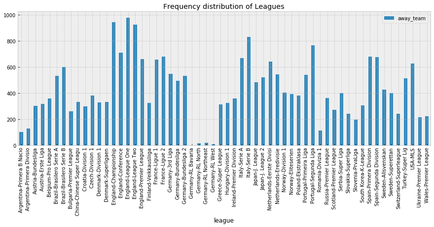
fig, ax = plt.subplots(figsize=(15, 5))
data.groupby('league').count()[['home_team']].plot.bar(
                      ax=ax,
                      title="Frequency distribution of Leagues over teams")
plt.show()
## get info about data
SoccerDataset.getDataInfo()
<class 'pandas.core.frame.DataFrame'>
RangeIndex: 24830 entries, 0 to 24829
Data columns (total 81 columns):
league           24830 non-null int8
teams_no         24830 non-null int64
date             24830 non-null int16
home_team        24830 non-null int16
away_team        24830 non-null int16
home_odd         24830 non-null float64
draw_odd         24830 non-null float64
away_odd         24830 non-null float64
h_played         24830 non-null int64
a_played         24830 non-null int64
ph_ladder5       24830 non-null int64
ph_ladder4       24830 non-null int64
ph_ladder3       24830 non-null int64
ph_ladder2       24830 non-null int64
ph_ladder1       24830 non-null int64
h_ladder         24830 non-null int64
pa_ladder5       24830 non-null int64
pa_ladder4       24830 non-null int64
pa_ladder3       24830 non-null int64
pa_ladder2       24830 non-null int64
pa_ladder1       24830 non-null int64
a_ladder         24830 non-null int64
h_won            24830 non-null int64
h_drawn          24830 non-null int64
h_lost           24830 non-null int64
h_scored         24830 non-null int64
h_conced         24830 non-null int64
h_points         24830 non-null int64
a_won            24830 non-null int64
a_drawn          24830 non-null int64
a_lost           24830 non-null int64
a_scored         24830 non-null int64
a_conced         24830 non-null int64
a_points         24830 non-null int64
h_ladder_h       24830 non-null int64
h_played_h       24830 non-null int64
h_won_h          24830 non-null int64
h_drawn_h        24830 non-null int64
h_lost_h         24830 non-null int64
h_scored_h       24830 non-null int64
h_conced_h       24830 non-null int64
h_points_h       24830 non-null int64
a_ladder_a       24830 non-null int64
a_played_a       24830 non-null int64
a_won_a          24830 non-null int64
a_drawn_a        24830 non-null int64
a_lost_a         24830 non-null int64
a_scored_a       24830 non-null int64
a_conced_a       24830 non-null int64
a_points_a       24830 non-null int64
h_form           24830 non-null int64
a_form           24830 non-null int64
h_elo            24830 non-null int64
a_elo            24830 non-null int64
h_offensiv       24830 non-null int64
h_defensiv       24830 non-null int64
a_offensiv       24830 non-null int64
a_defensiv       24830 non-null int64
h_clean          24830 non-null float64
a_clean          24830 non-null float64
h_fail           24830 non-null float64
a_fail           24830 non-null float64
h_clean_h        24830 non-null float64
a_clean_a        24830 non-null float64
h_fail_h         24830 non-null float64
a_fail_a         24830 non-null float64
h_goal_signal    23823 non-null float64
a_goal_signal    23834 non-null float64
Ladder_signal    24830 non-null int64
RESULT           24830 non-null int64
h_final          24830 non-null object
a_final          24820 non-null float64
h_half           15729 non-null float64
a_half           15729 non-null float64
BTS              24830 non-null int64
H1H              17365 non-null float64
A1H              17365 non-null float64
H2H              17365 non-null float64
A2H              17365 non-null float64
Unnamed: 79      262 non-null object
Unnamed: 80      262 non-null object
dtypes: float64(20), int16(3), int64(54), int8(1), object(3)
memory usage: 14.8+ MB
As we can see from the above cell result, we have 7 categorical, 1 date and 73 numerical features. It seams that most of data features has equal non-null values. However, the last two unnamed features has more than 98% null value and it seems they are annotation column than real value. So, I will fix it at data cleaning step later. Moreover, we need to work on also feature reduction through insights from analysis by focusing on only informative features. Next, lets inspect distribution of each features and their interaction.
## to check distribution of each categorical features we should define data type to appropriate value.
##Here I am casting data type of all categorical features to int16 except RESULT column.
## Because later, I will replace the values of target column to fixed number to indicate WIN, LOSS and DRAW
data['league'] =data['league'].astype('category').cat.codes
data['home_team'] =data['home_team'].astype('category').cat.codes
data['away_team'] =data['away_team'].astype('category').cat.codes
data['date'] =data['date'].astype('category').cat.codes
## lets split data based on result feature to explore probability of winning if home or away team

data['RESULT'] = data['RESULT'].replace(['HOME'], 'WIN')#win
data['RESULT'] = data['RESULT'].replace(['AWAY'], 'LOSS')#loss
data['RESULT'] = data['RESULT'].replace(['DRAW'], 'DRAW')#draw

data['RESULT'].head()
0    DRAW
1    DRAW
2     WIN
3    DRAW
4     WIN
Name: RESULT, dtype: object
## lets split data based on result feature to explore probability of winning if home or away team
# score_data_home = data[data['RESULT'] == 'HOME'] ##only home
data['RESULT'] = data['RESULT'].replace(['HOME'], 'LOSS')
data['RESULT'] = data['RESULT'].replace(['AWAY'], 'WIN')
data['RESULT'] = data['RESULT'].replace(['DRAW'], 'DRAW')
data['RESULT'].head()
0    DRAW
1    DRAW
2    LOSS
3    DRAW
4    LOSS
Name: RESULT, dtype: object
Relationship of playing at Home or Away with Result
# data=data.loc[data['RESULT'] == 'HOME']
sns.set(rc={'figure.figsize':(10,300)})
ax=sns.countplot(y='home_team',hue='RESULT',data=data)
for p in ax.patches:
    patch_height = p.get_height()
    if np.isnan(patch_height):
        patch_height = 0
    ax.annotate('{}'.format(int(patch_height)), (p.get_x()+0.01, patch_height+3))
plt.title("Teams played at Home Vs. Chance of win/Loss/Draw")
plt.show()
Only sample for look. The first 500 teams
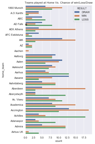
From the above plot, we can see that playing at home (one with orange color) has great chance to win than playing away(one with green color).
sns.set(rc={'figure.figsize':(10,300)})
ax=sns.countplot(y='away_team',hue='RESULT',data=data)
for p in ax.patches:
    patch_height = p.get_height()
    if np.isnan(patch_height):
        patch_height = 0
    ax.annotate('{}'.format(int(patch_height)), (p.get_x()+0.05, patch_height+10))
plt.title("Teams played at Away Vs. Chance of win/Loss/Draw")
plt.show()
Only sample for look. The first 500 teams
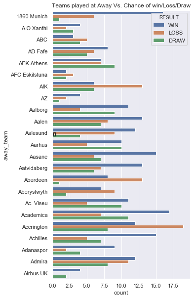
The same result is shown for away also. Most of the teams has better chance to win at home than away.
_=data.hist(figsize=(16, 20), bins=50, xlabelsize=8, ylabelsize=8)
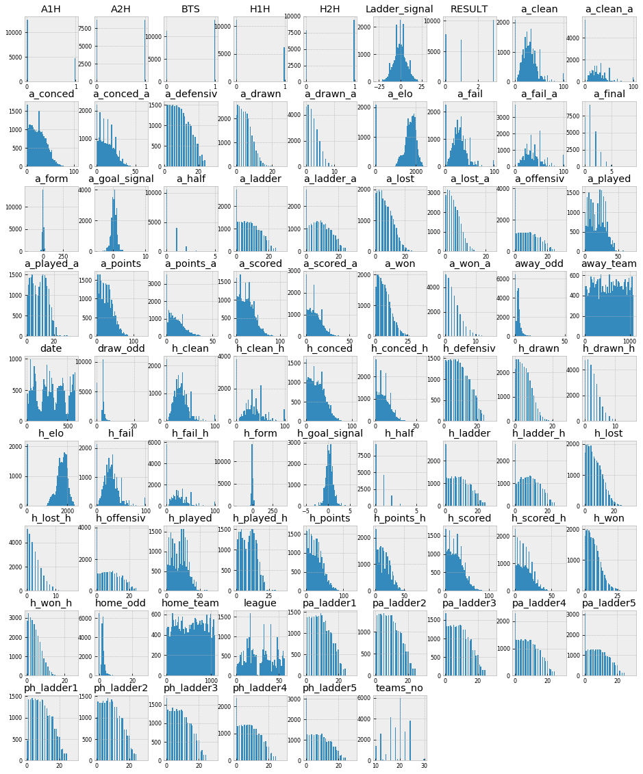
As we can see from the above distribution plot, most of features in the same group has same distribution. For example pa_ladder 1,2,3,4,5 with ph_ladder 1,2,3,4,5. So,we can merge the features.
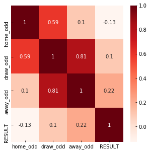
#Using Pearson Correlation
plt.figure(figsize=(5,5))
cor=data[['home_odd','draw_odd','away_odd','RESULT']].corr()
sns.heatmap(cor, annot=True, cmap=plt.cm.Reds)
plt.show()
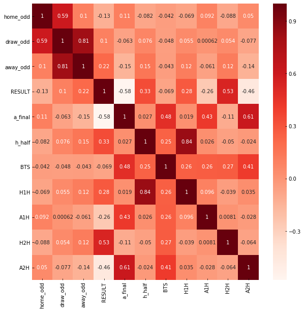
#Lets explore more about corelation with other final result values
#Using Pearson Correlation
plt.figure(figsize=(10,10))
cor=data[['home_odd','draw_odd','away_odd','RESULT']].corr()
sns.heatmap(cor, annot=True, cmap=plt.cm.Reds)
plt.show()
#Teams played more than 10 games
played_teams_count = data['home_team'].value_counts()
no_game_played=[]
most_played_teams=[]
for i,team in zip(played_teams_count.index,played_teams_count.values):
    if team>10:
            no_game_played.append(team)
            most_played_teams.append(i)
soccer_data=pd.DataFrame({'Team':most_played_teams,'GameCount':no_game_played})
soccer_data.tail(20) ##to check it only includes game count greater than 10. N:B: the data is decendingly sorted.
| Team | GameCount | |
|---|---|---|
| 856 | Betis | 12 |
| 857 | Como | 12 |
| 858 | Zweigen K | 12 |
| 859 | Ponferradina | 12 |
| 860 | Roasso K | 12 |
| 861 | Zwiegen K | 12 |
| 862 | Mafra | 12 |
| 863 | Airbus UK | 12 |
| 864 | Daegu | 11 |
| 865 | Juventude RS | 11 |
| 866 | Modena | 11 |
| 867 | Rangers | 11 |
| 868 | Atletico CP | 11 |
| 869 | Presov | 11 |
| 870 | Norrby | 11 |
| 871 | Osters IF | 11 |
| 872 | Hradec Kralove | 11 |
| 873 | Tianjin Quanjian | 11 |
| 874 | Brommapojkarna | 11 |
| 875 | CSMS Iasi | 11 |
import numpy as np
corr = data.corr()
fig = plt.figure(figsize=(25,25))
ax = fig.add_subplot(111)
cax = ax.matshow(corr,cmap='coolwarm', vmin=-1, vmax=1)
fig.colorbar(cax)
ticks = np.arange(0,len(data.columns),1)
ax.set_xticks(ticks)
plt.xticks(rotation=90)
ax.set_yticks(ticks)
ax.set_xticklabels(data.columns)
ax.set_yticklabels(data.columns)
plt.show()
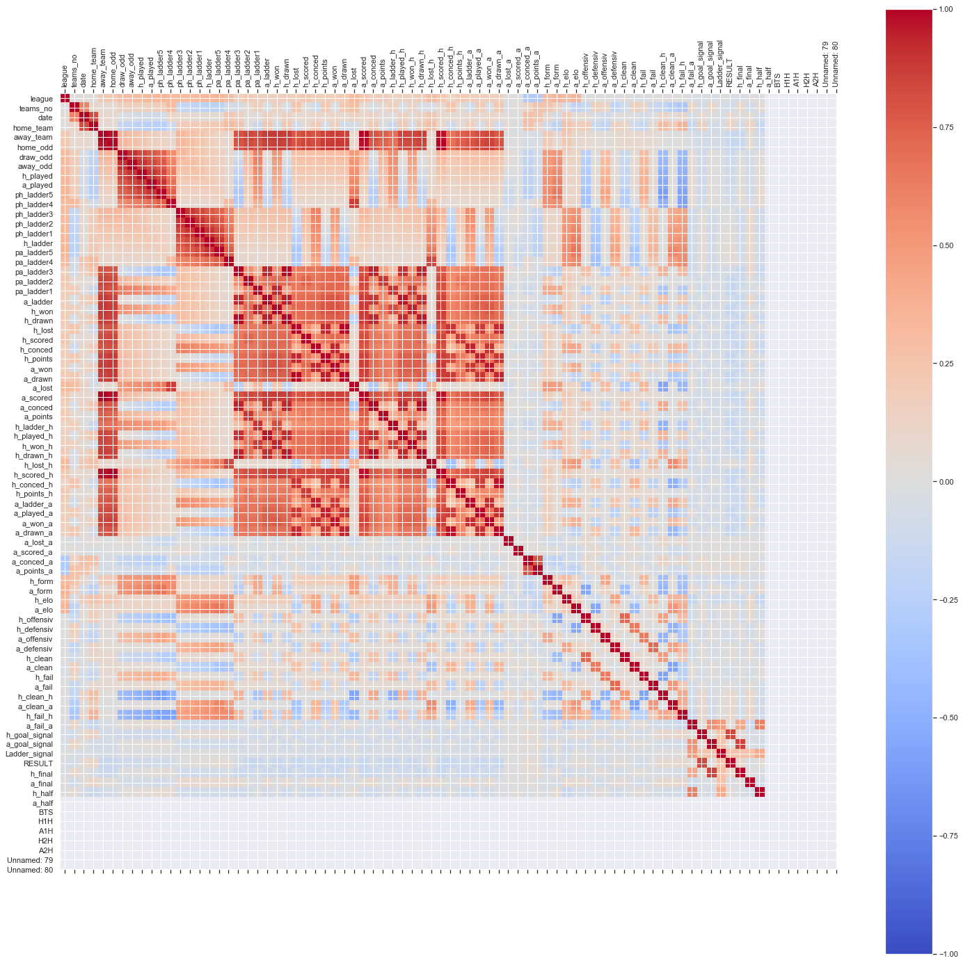
From the above correlation matrix when there is no correlation between 2 variables (when correlation is 0 or near 0) the color is gray. The darkest red means there is a perfect positive correlation, while the darkest blue means there is a perfect negative correlation. The matrix gives as interesting focus to drop or retain features and which features has great impact. But before decision we should resample the data to minimize influence of outliers.
target_count = data.RESULT.value_counts()
print('AWAY:', target_count[0])
print('HOME:', target_count[1])
print('DRWAN:', target_count[2])
fig, ax = plt.subplots(figsize=(5, 5))
ax.tick_params(axis='x', labelsize=15)
ax.tick_params(axis='y', labelsize=10)
ax.set_xlabel('Result', fontsize=15)
ax.set_ylabel('Class Count' , fontsize=15)
ax.set_title('Distribution of traget classes (AWAY/HOME/DRAWN)', fontsize=15, fontweight='bold')
_=target_count.plot(ax=ax, kind='bar')
AWAY: 10194
HOME: 7756
DRWAN: 6880
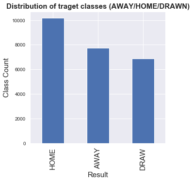
##As we can see from the result, data distribution for AWAY, HOME and DROWN is relatively unballanced so I have to consider
## ballancing mechanisims appropriate to the problem. Lets use ... approach because of